Trade shows: Flexfit®
Developed concepts and layouts for trade show booths, along with a full suite of supporting materials—including custom headwear, UI elements, print collateral, web and social promos, and email blasts—to create a cohesive and engaging brand presence.
Outdoor retailer show
For this outdoor retail show, we developed the booth concept "Hidden Gem", drawing inspiration from the natural world and the thrill of discovery in the outdoors. The design was influenced by the dramatic landscapes of canyons and the mysterious metal monolith discovered in Utah.
The core idea centered around the caps being hidden treasures—like crystals found within rocks or unexpected artifacts in nature. We wanted visitors to feel as though they were stumbling upon something special and rare, much like finding a hidden gem in the wild.
Final Booth
Custom Cap Design

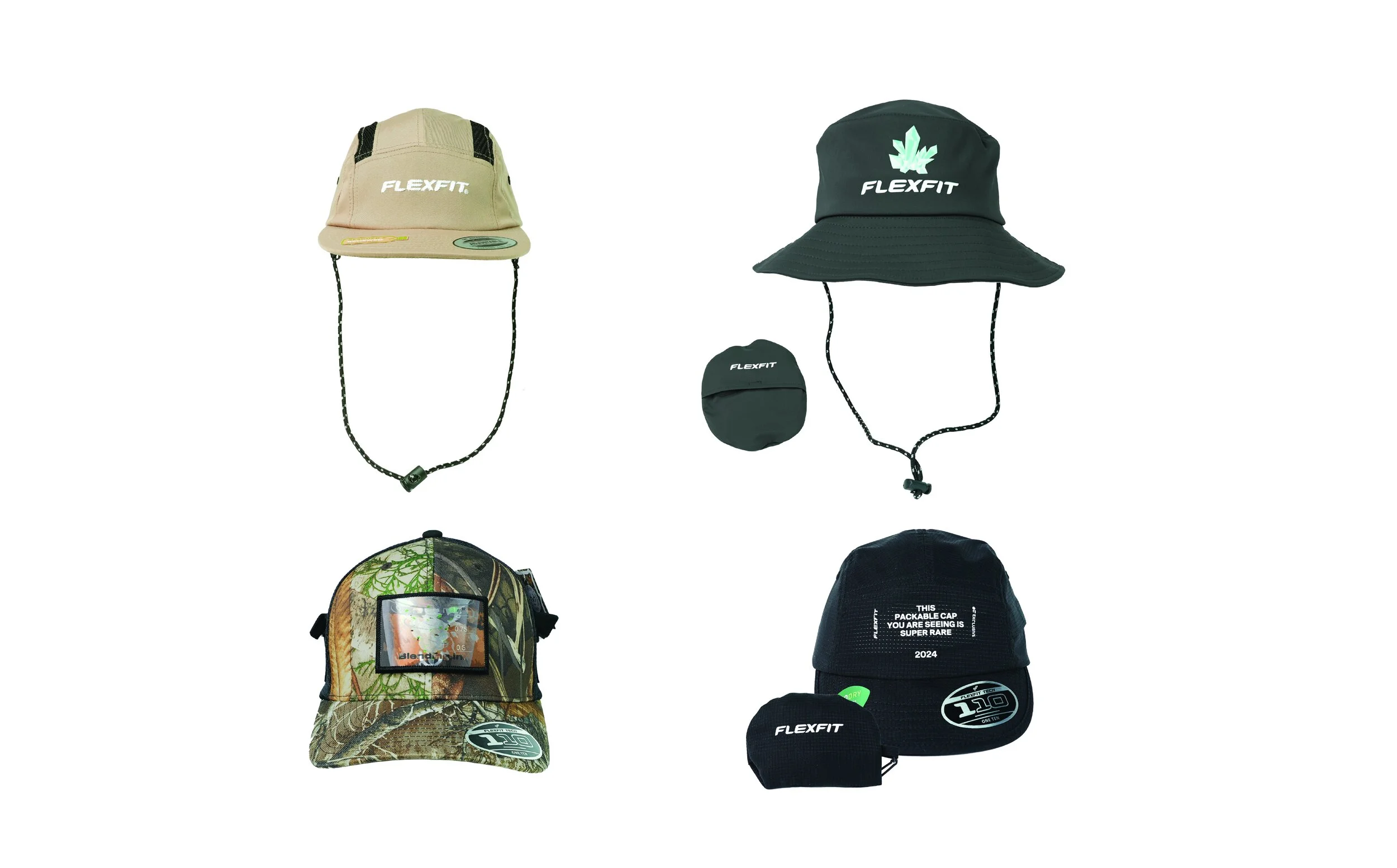
Custom Cap Design: For this show, we aimed to spotlight our custom programs by demonstrating the range of customizations available. I conceptualized and designed fully customized caps with functional features tailored to outdoor activities, aligning with the show's theme. I began by brainstorming functions not typically found in caps but that could offer practical value outdoors. After mocking up several ideas, I moved into detailed design, including measurements, material placement, and construction notes. The final caps included side-panel pockets, a packable bucket hat, a jockey cap designed for easy storage, and a mesh jockey cap featuring discreet slits to securely hold sunglasses in place over the brim.
Promotional Materials


Email Blasts sent to show goers: For the post-show e-blasts, I aligned the design with the booth concept to maintain a cohesive visual identity. Since this show focused on promoting our custom programs, the e-blast showcased all the custom caps featured at the event and included direct links to our custom program web pages, driving targeted traffic and continued engagement.

Vending Machine UI
Vending Machine UI: For this UI, I designed the interface to visually align with the vending machine's aesthetic. The machine was wrapped in silver chrome to evoke the feel of the Utah monolith, so I crafted a UI that felt futuristic, clean, and minimal. This contrast between the natural booth setup and the sleek, tech-forward vending machine was intentional, highlighting how our modern, tech-enhanced hats are the ideal choice for outdoor activities.
Data
QR Engaged Sessions : 144
Lead Summary: 576
E-Blast Open %: 22.9
Click %: 2.4
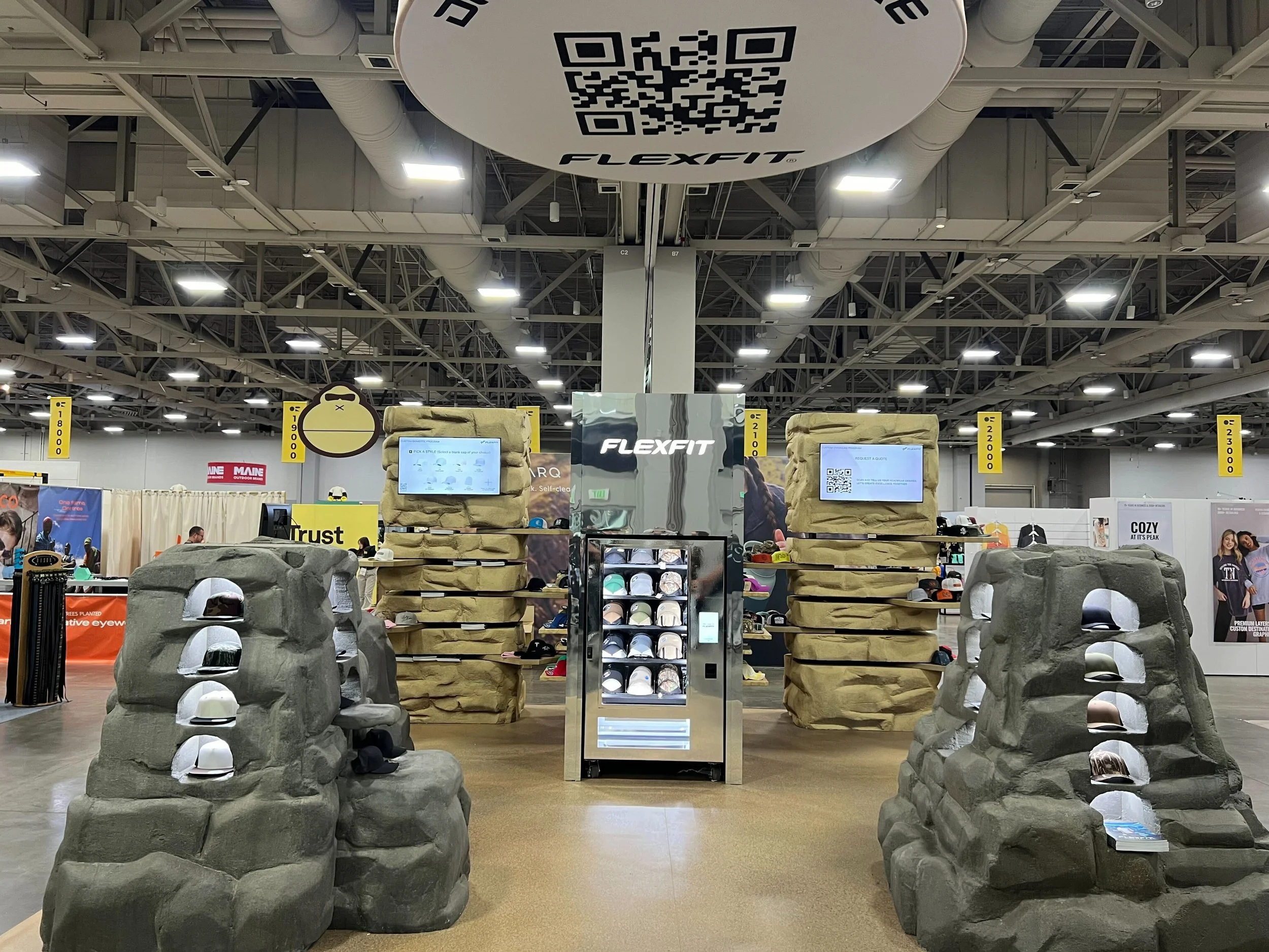
PGA Show
2024
For this booth, we developed the concept “Out of Bounds”—a golf-themed extension of our larger campaign, “Everywhere, Every Wear.” The idea: even when a ball goes out of bounds, you’ll find our hats. To bring this to life, we built a custom hat vending machine that doubled as both a giveaway station and an entryway into the booth. The booth itself was designed to feel just beyond the edge of a golf green, featuring interactive activations like a water sprayer to demo our water-repellent hats.
Initial Render

Vending Machine
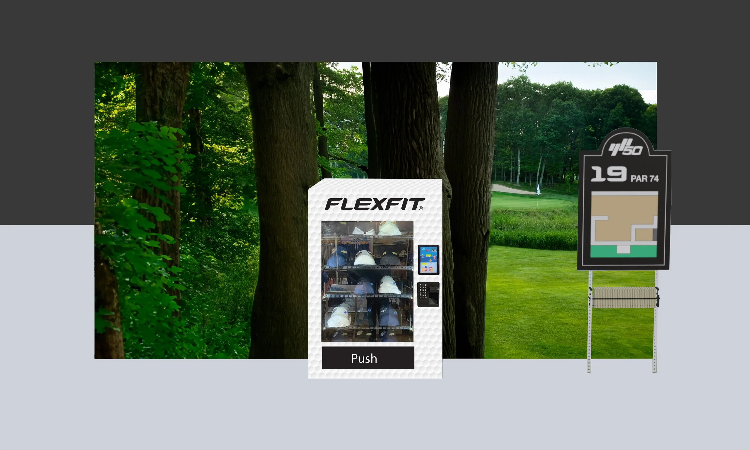
Vending Machine Exterior design: I designed the exterior wrap of the vending machine, featuring a golf ball texture to reinforce the “Out of Bounds” concept—the machine itself representing the ball that landed off-course.
Data
Lead Summary: 2,017 (+1292% from previous year)
QR Code Engaged Sessions: 84
Initial Render
E-Blast Open %: 34.3
Click %: 2.5

Vending Machine UI
Vending Machine UI: For this UI, I designed it to match the design of the booth, more specifically the custom patch wall. I used the designs I made for the patches in the UI to keep consistency of the storyline of the booth. Because all the caps in the vending machine were custom velcro caps, the insight we sought to gain from users of the vending machine was whether people preferred fitted or adjustable caps
Final Booth
Promotional Materials

Final Booth

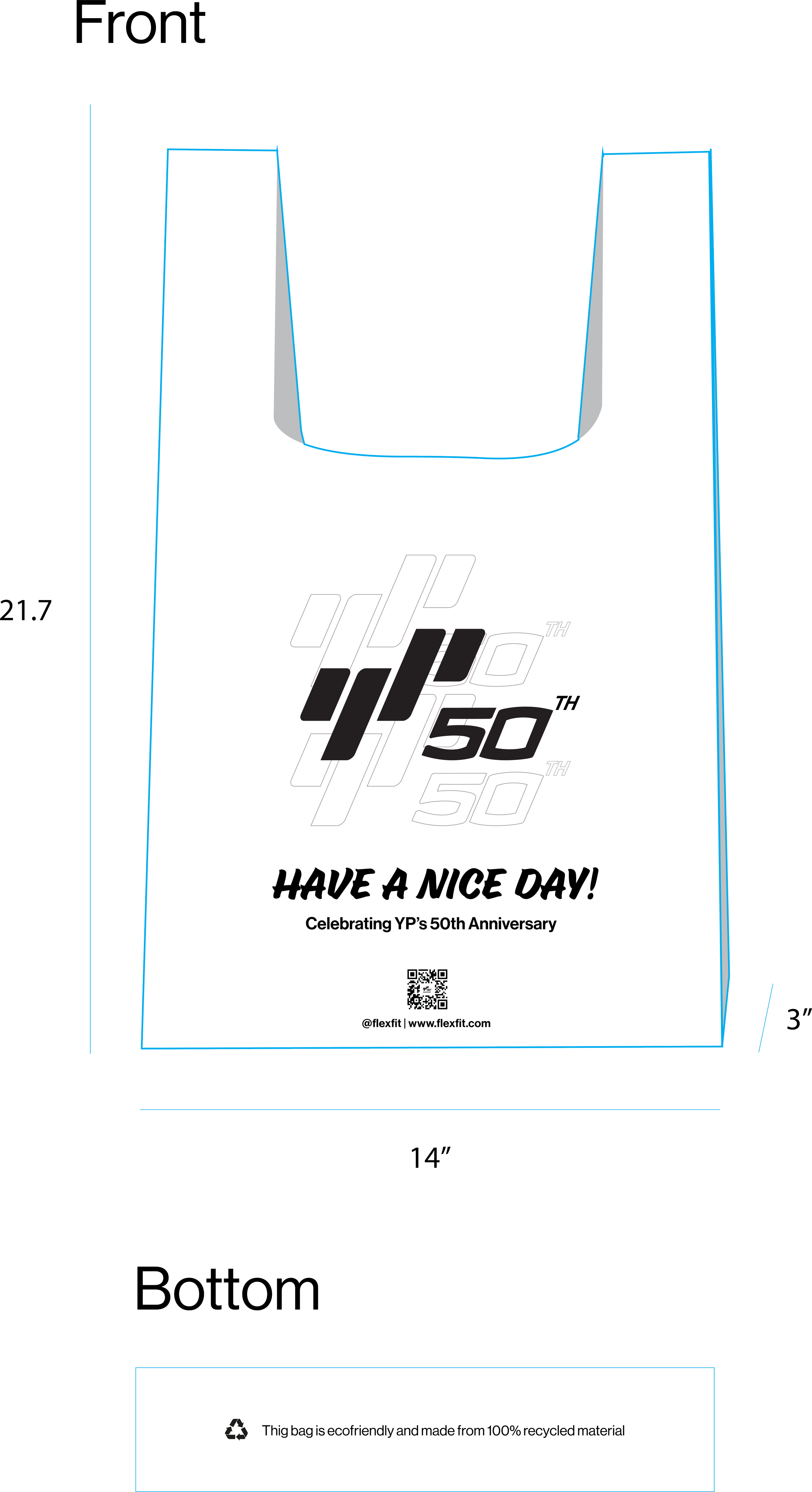
Email Blast sent to show goers post show: To extend the impact of our trade show presence, we sent post-show email blasts featuring a GIF from the event to help attendees recall the experience. The emails included links to the hats we gave away, directing users to product detail pages on our website for easy follow-up and engagement. I designed these to not only match the concept but the theme of the trade show.
2025
This booth built on our “Out of Bounds” concept, but brought the theme closer to the green—symbolizing that the closer you are to choosing our hats, the closer you are to “making the hole.” The focus was on our custom programs, featuring velcro caps as giveaways and a wall of custom patches for attendees to personalize their hats on the spot. The goal was to create an interactive, hands-on experience that showcased our customization offerings.
Patch Wall

Data
E-Blast Open %: 41.5
Click %: 8.5
Impressions Expo
2024
Inspired by the world around us, we developed a futuristic supermarket concept for the 2024 catalog. To maintain a cohesive narrative, we carried this vision through to our trade show presence. The central theme: everything we offer is fresh, from our ideas to our products.
Vending Machine

Vending Machine Exterior design: To maintain consistency with the overall concept and supporting design materials, I designed the vending machine’s exterior to evoke the look and feel of a supermarket delivery truck. I incorporated custom cap designs as playful “fruits” and added a slogan that reinforces the theme of freshness.
Promotional Materials


Promotional design: Across all print and promotional materials—posters, flyers, business cards, social assets, e-blasts, and web banners, I maintained visual consistency using the same color palette, typography, and graphic elements. A key design challenge was balancing the playful supermarket theme with our tech-focused brand identity. I approached this by emphasizing the product and its technology in each piece, while selectively incorporating only the most iconic supermarket-inspired elements. This allowed the materials to stay on theme without compromising the brand’s clean, minimal aesthetic.
Data
Lead Summary: 2,066 (+44% from previous year)
QR Code Engaged Sessions: 66
Final Booth
E-Blast Open %: 44.3
Click %: 1.5

Vending Machine UI
Wall Display Poster
Vending Machine UI: For the UI, I maintained the journal/student note-taking theme to ensure consistency. Similar to the 2025 PGA UI, we focused the survey on hat sizing to gather insights into show guests’ preferences.

Patch Display + Patches: Given the science classroom theme of the booth, we incorporated a “science fair” section to showcase our eco-friendly products. For this, I designed a display poster that emulated a classic science fair project, providing information about our eco products and their environmental benefits. I left space on the poster for real hats and props, ensuring the display felt like an authentic school project while also being informative.
Final Booth
2025
For this booth, we followed a similar approach to our previous setup, aligning the booth theme with our catalog. This time, the theme was school-inspired, aimed at educating current and potential customers about our technology and products. We styled the booth as a science classroom, using the concept of experimentation to demonstrate how and why our technology works.
Patch Display and Patches
Promotional Materials


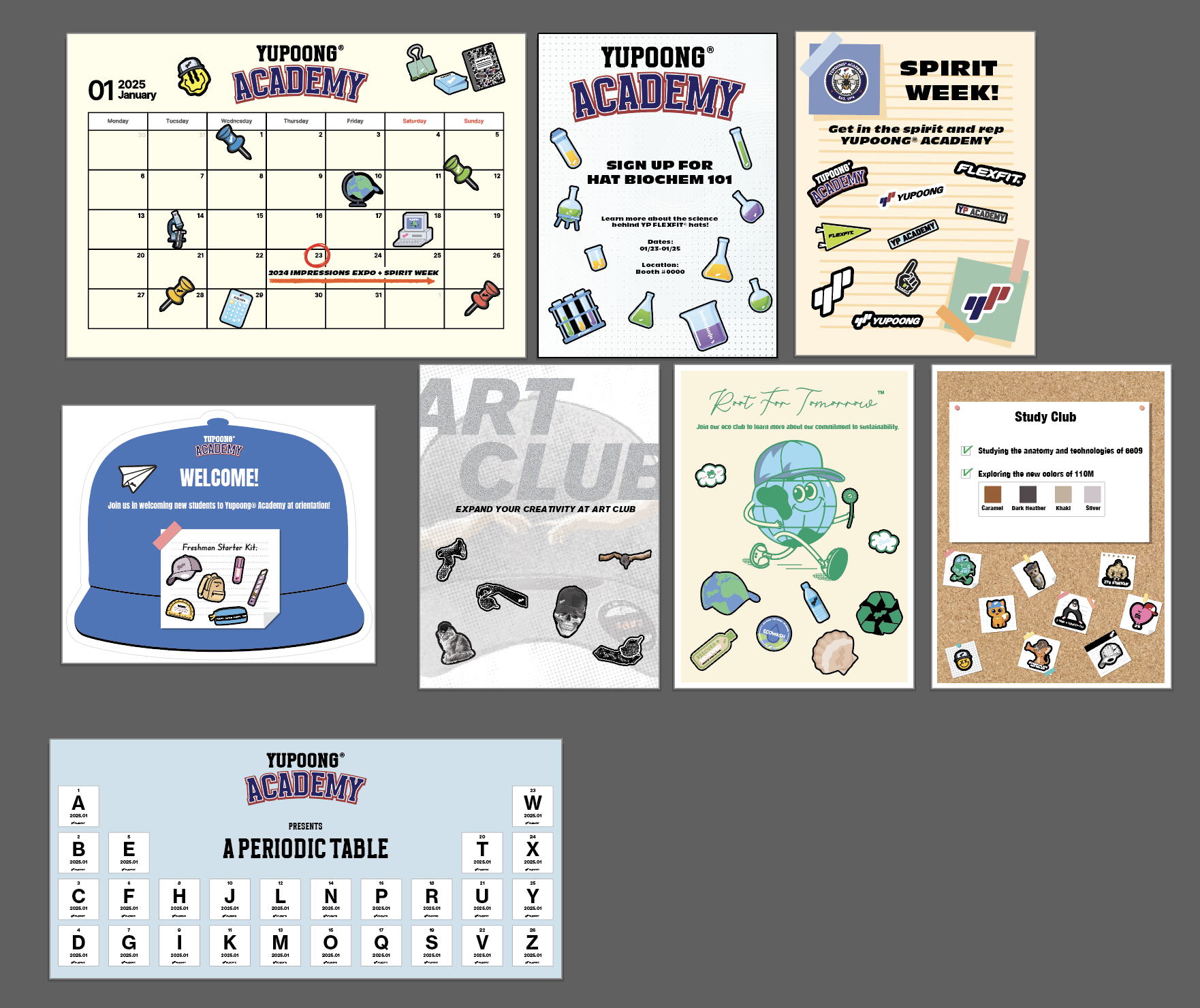
Patch Display + Patches: Similar to our 2025 PGA booth, the giveaway caps were blank Velcro hats with custom patches that highlighted our customizable programs, showcasing how customers can personalize their hats. Each patch was designed with the booth’s interactive, school-themed display in mind. The booth featured posters on the walls that resembled a school hallway, styled like school club flyers. The patches served as graphic elements, evoking the look of tear-off flyers, encouraging visitors to engage with the display and customize their experience.

E-Blast + Social Post: For the email blasts and social posts, I designed them to align with the school theme, incorporating imagery inspired by journals and student note-taking. For other materials, I selected a collegiate font typically used in academic settings to further reinforce the theme.


Custom Caps

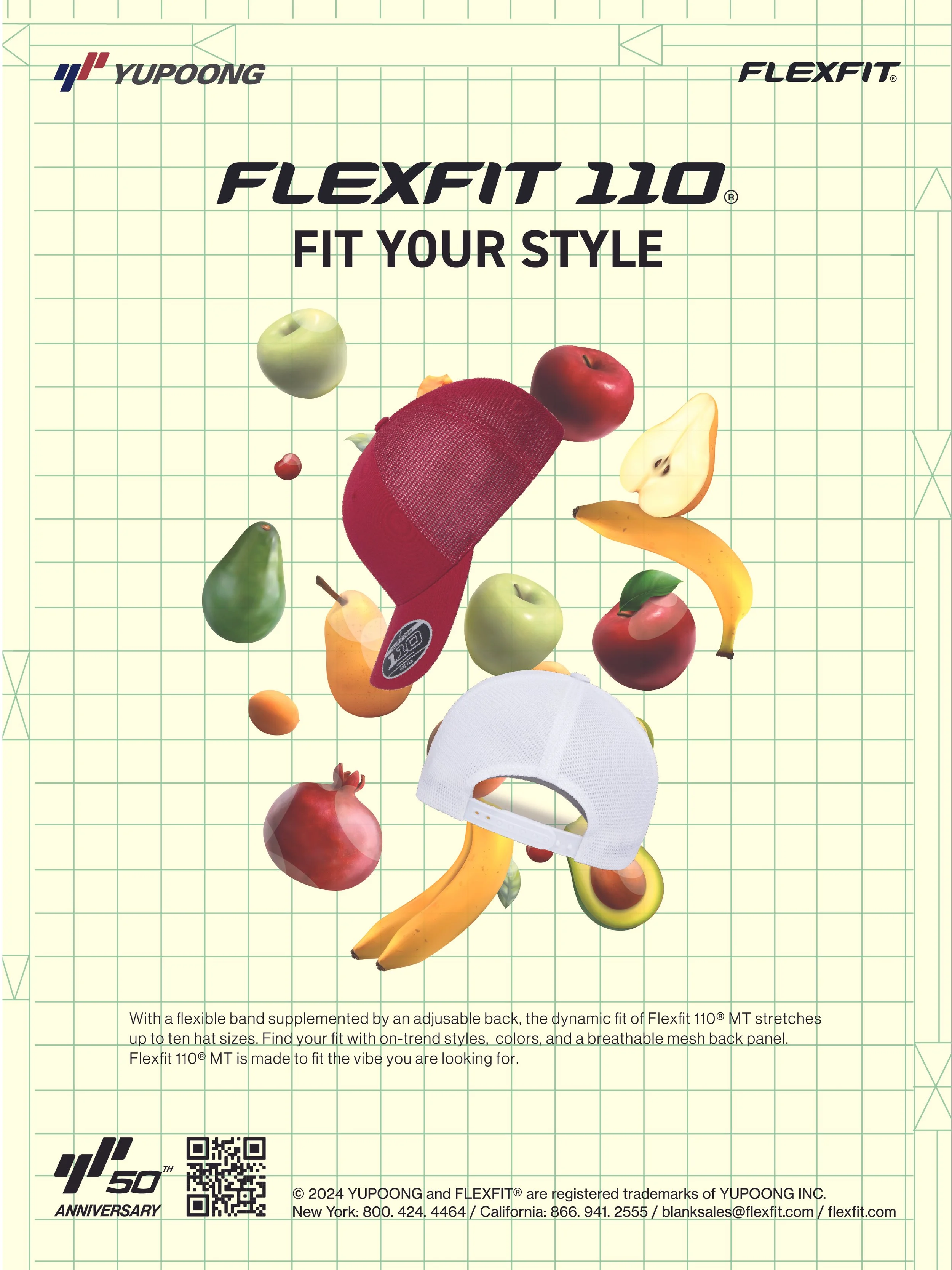
Custom Cap design Example: For the giveaway, we designed custom embroidered hats that tied directly into the theme. I carried over the fruit imagery from the rest of the visual system to ensure a cohesive and thoughtfully branded experience. The hats were distributed through the vending machine, adding an interactive and memorable touch to the activation.
Vending Machine UI: The UI extended the fruit-inspired theme with a fresh, vibrant color palette reminiscent of supermarkets. To support the launch of our new hat, we included a survey asking about sizing and color preferences, helping us understand which aspects matter most to users.

-
![]()
2024 ICAST Show
Contributions:
- Booth concept ideation
- Social post design
- E-blast design
- Business card design
- Flyer Design
- Vending machine exterior + UI design
- Web Ad Design
- Fully custom hat design
Data:
- Lead Summary: 1,259
- E-Blast Open %: 40.4
- Click %: 1.9
-
![]()
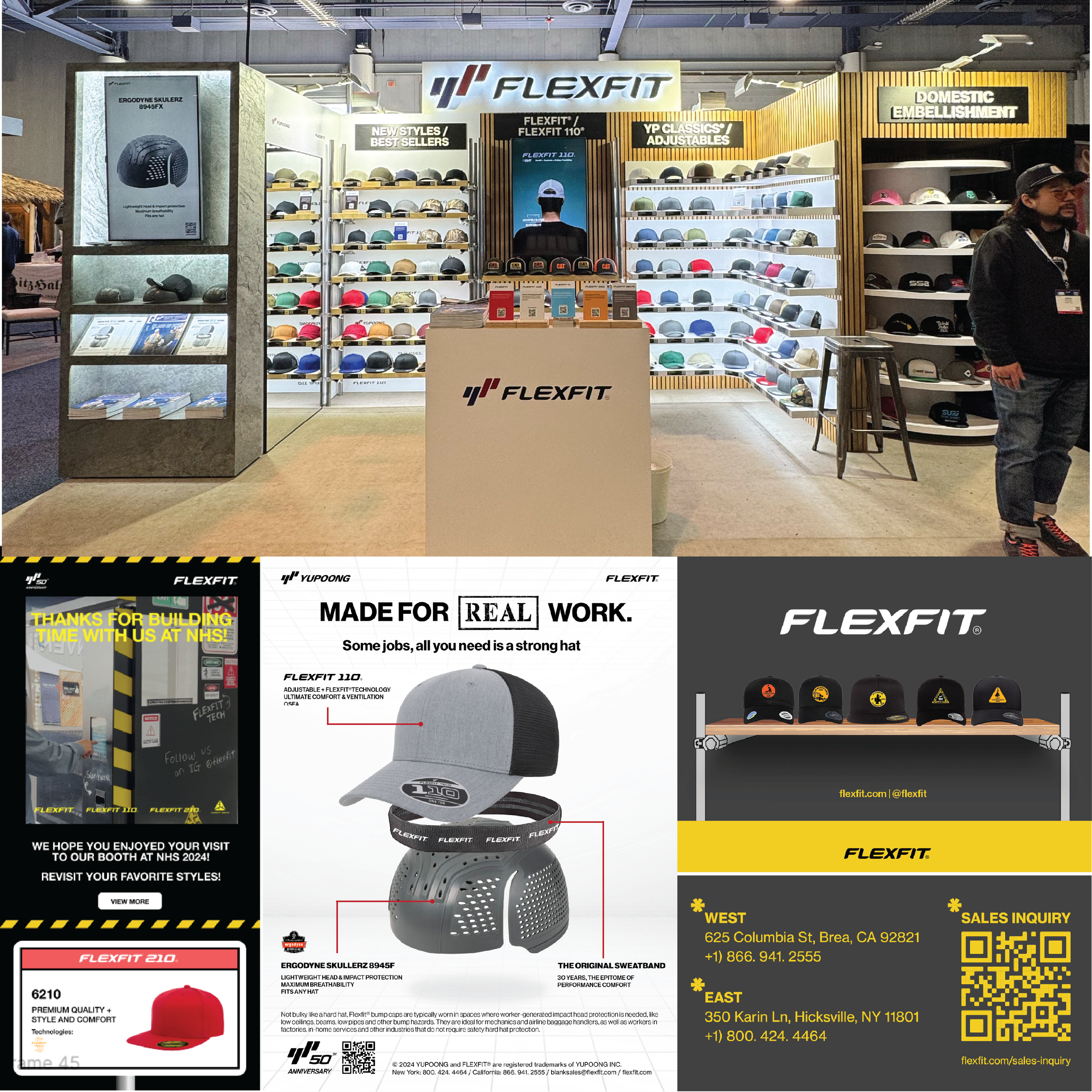
2024 National Hardware Show
Contributions:
- Booth concept ideation
- E-blast design
- Business card design
- Flyer Design
- Vending machine exterior + UI design
Data:
- Lead Summary: 327
- E-Blast Open %: 51
- Click %: 3.1
-
![]()
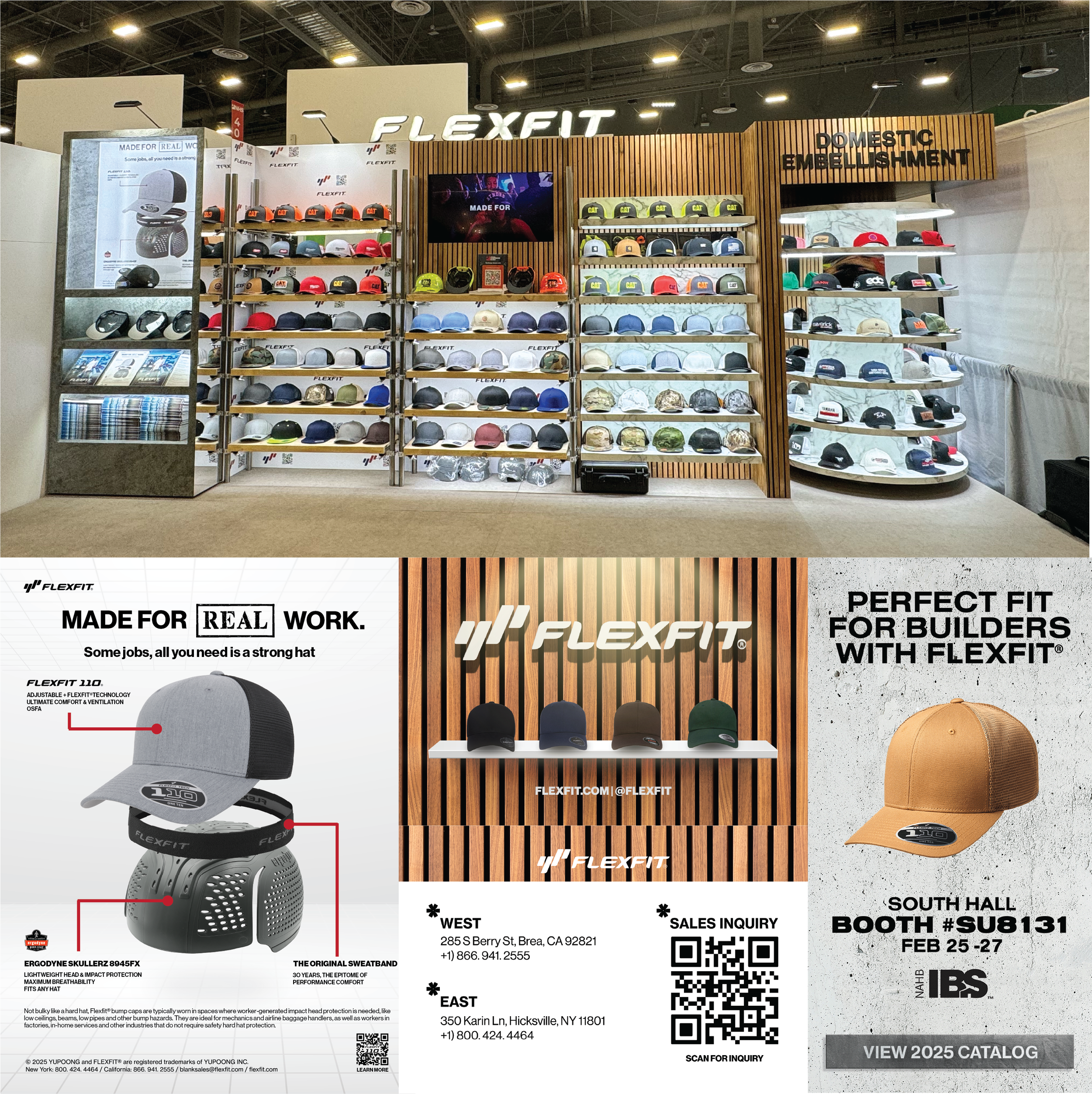
2024 International Builders' Show
Contributions:
- Booth concept ideation
- E-blast design
- Business card design
- Flyer Design
Data:
- Lead Summary: 212
- Click through %: 3.52
- Clicks: 6,751